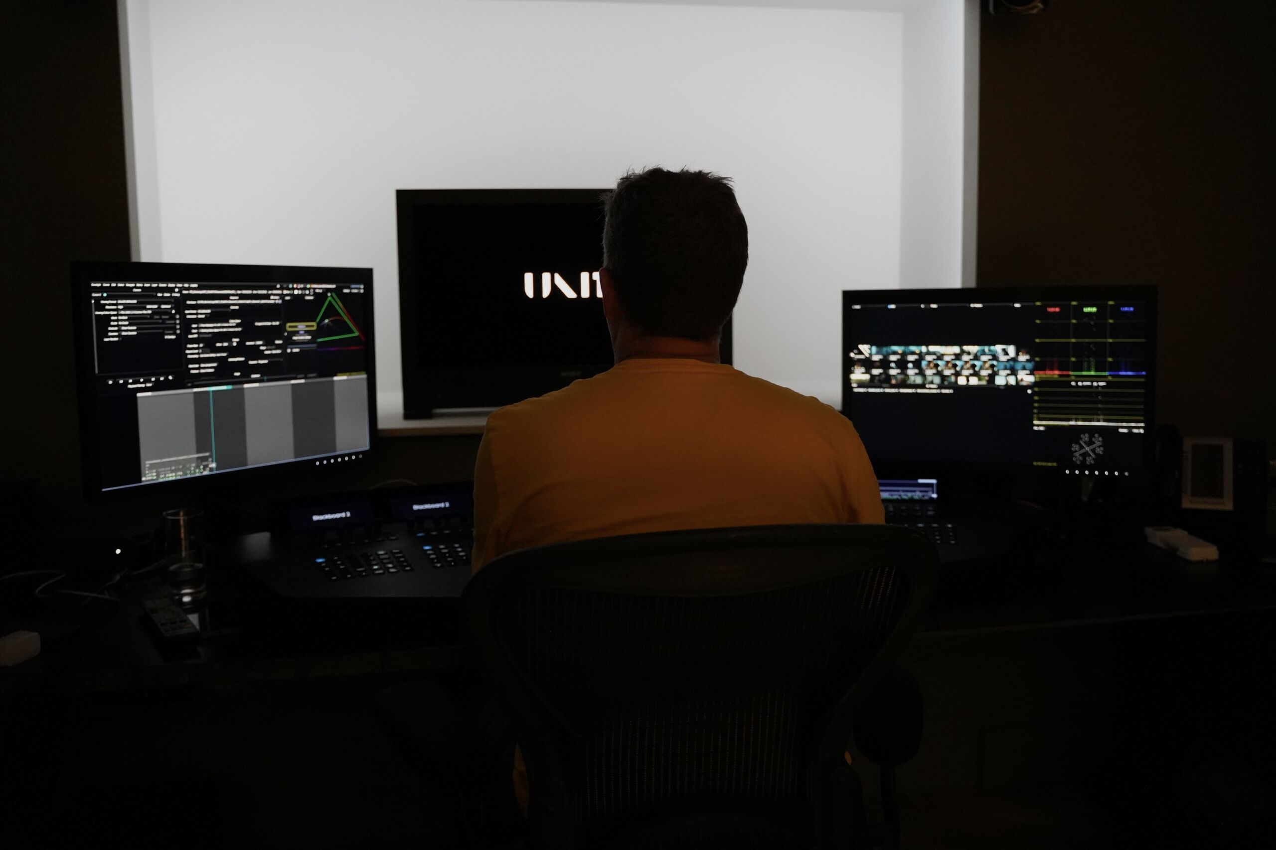
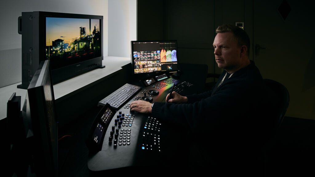
An Interview with UNIT’s Senior Colourist, Dan Coles.
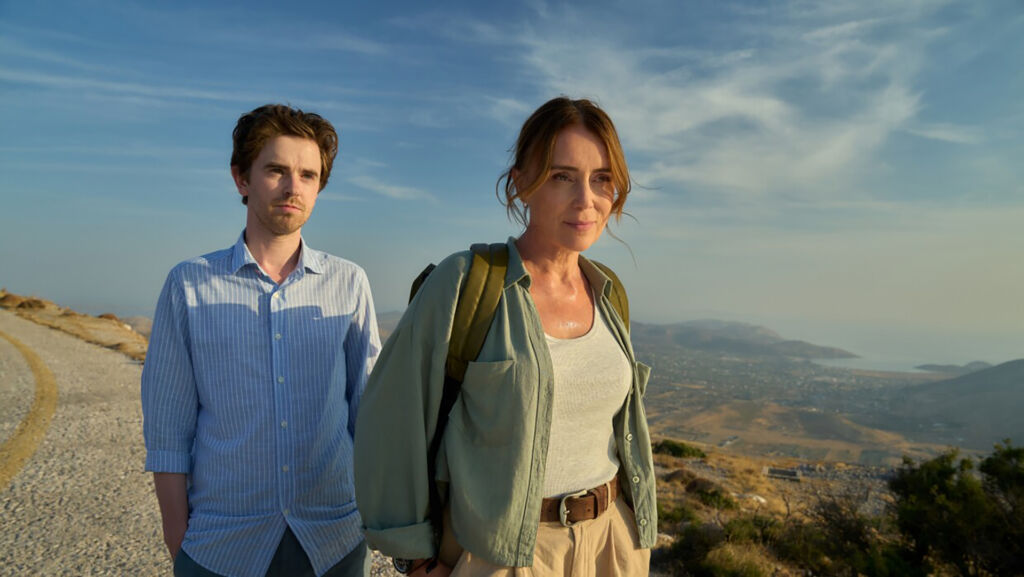
- In one of your most recent projects Malice, the series demanded a very specific tone and mood. How did you adapt your grading methodology to reflect this, and how did Baselight’s tools help you manage complex sequences?
Malice was set between London and Paros in the Greek Islands and so had two quite specific looks to manage across the series. Principal photography was on Sony Venice with additional footage such as drone and GoPro – we used a colour managecomd workflow in Aces colourspace and created both SDR and HDR deliverables for Amazon Prime. In terms of grading methodology we wanted rich, warm and vibrant – luxurious and inviting for Paros. London was less vibrant and slightly more sinister – more naturalistic in tone with a strong contrast.
Some of the more complex sequences in any show tend to be outside with varied lighting conditions on multiple camera formats where a good deal of matching is required. Baselight’s toolset is very complex and sophisticated – so not only are we able to match colour contrast and light but also the look of a lens, and the overall texture, shape, depth and detail of the image.
- On Trigger Point Season 3, how did you approach the grading to support the tension and pacing of the drama?
For Trigger Point Season 3 Chas Bain (DoP) wanted to use a LUT he had created with his DIT. The LUT gave him the cool blue and green look he was after as a starting point and I was able to use X Grade to successfully and quickly bring back skin tones into a warmer and more naturalistic tone. We used vignettes along with selective shaping and the flare tool to enhance depth and create a cool and slightly muted filmic feel to support and add weight to the tension of the drama.
- The Assassin presented unique stylistic challenges. How did you approach the colour and lighting to support its narrative?
For The Assassin Laurent Bares (DoP) shot on Alexa 35. We also had a lot of drone footage to match in.
We ended up using a print emulation LUT in the baselight grade stack giving us a more filmic and cinematic feel to the images – a softer rolloff both in highlight and in shadow detail and a nicer separation in terms of colour with cooler cyan tones in mid and darker tones. With this kind of feel as our starting point we were then able to create custom variations to our look on a per country basis – we ended up with different looks (some more subtle than others) for countries such as Greece, France, Libya, Bulgaria, Albania and England to mark and enhance a visual change in the narrative.
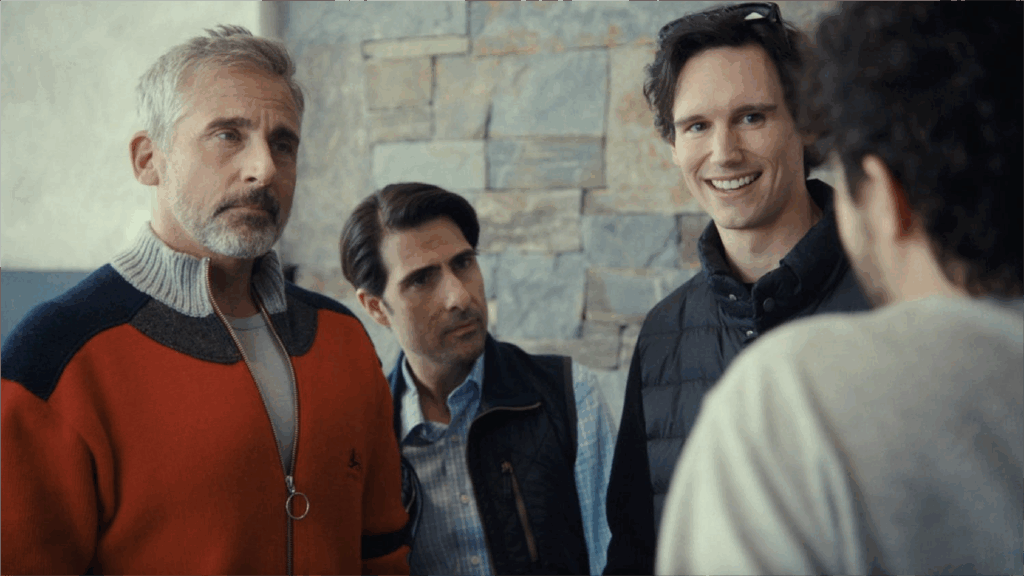
4. For Mountainhead you created a subtle cinematic look in the grade which supported the dark comedic elements within the film. Do you approach grading for a film differently to a series? And what role did Baselight play in maintaining creative and technical control throughout?
The grade for Mountainhead was approached in a very similar way to that of a series. We used a different kind of print emulation look that had a slighltly greener and warmer bias with the usual soft rolloff to highlight and shadow detail. We also used the Livegrain system alongside baselight adding grain to emulate a 35mm Kodak 200T film stock. We added tiny amounts of blur and halation selectively in baselight to further mimic the look of film.